Tuesday, 7 February 2012


Monday, 6 February 2012
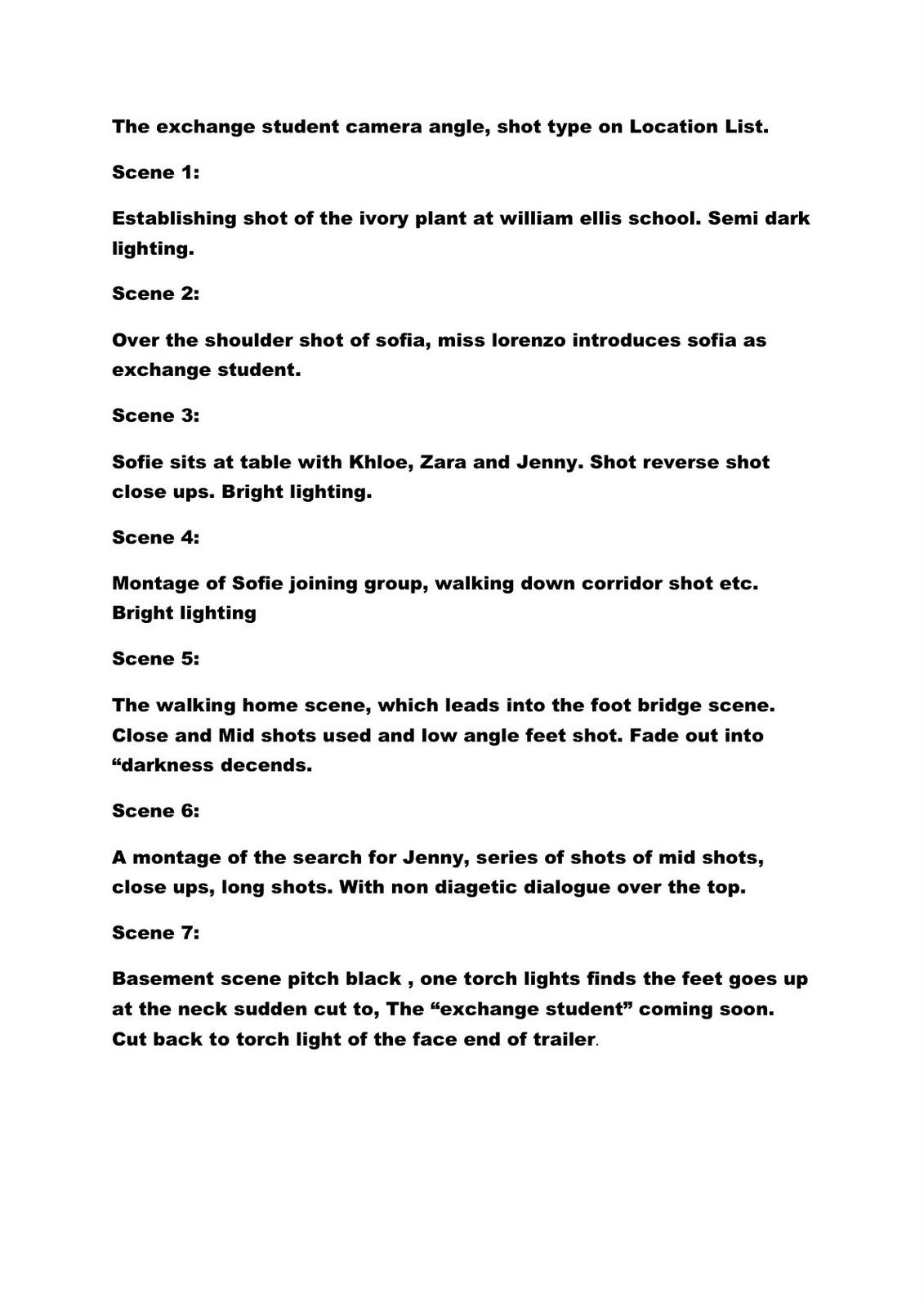
Evaluation questions for the process of production.
How did you use media technologies in the construction and
research, planning and evaluation stages?
To produce a product that can be synergised over a cross
media platform I used a variety of technologies. Using technology through out
the production enhances the gratification received by the audience. In the
research and planning stages I documented all work in an online blog which
gives greater accessibility for me to expand my evaluation by using portable
technology in a variety of environments to improve and evaluate my ideas and
thought for the product. The accessibility of using online technologies such as
a blog gratifies the audience’s needs to be able to interact with the product
they which to consume over a variety of platforms in different environments eg
on there smart phone on the bus with friends. To enhance this experience I used
slideshare a technology that is used to present ideas and thought process’s in
a formulaic structure throughout the planning and research stages. Using
slideshare was good to present ideas in a creative format however this did not
allow me to evaluate in greater depth on ideas or how they tie with key
concepts. Overall using this technology has more pro’s and cons because being
able to condense large amounts of writings into a presentation allows my
evaluation to have more of a impact. The technologies I used in the construction
stages reflect the complexity needed to layer through and meaning into the
product. For example I used Photoshop to create my magazine front cover and
poster. In each of these products visual imagery and strap lines, tag lines are
used to anchor meaning and inform the audience. Using Photoshop allowed me to
layer this as an exciting visual experience that informs the audience why, who
and where can they see, get this product. Though Photoshop has all the
necessary tools for this it is a lengthy process in creating a product. For
example some things that look good on paper in planning does not come off in
Photoshop so you have to try something else. However this is also a good thing
about using Photoshop as there room to adjust and try something else.
For filming and product construction I used a digital SLR
camera on a tripod for smooth shoots. This was successful as it was portable
and could be used to pull off a variety of shot. Although the focus on the
camera was some times fiddly and did not come off as clearly as others limiting
the amount of footage to work with. Using the SLR meant our footage was
compatible with HD giving a big screen experience and clear sound.
Tuesday, 15 November 2011
Technical exercise with a Canon DS1
In a previous exercise we used a flip camera to film tension through a variety of angles and to edit the final product. In this exercise we used a canon ds1 camera to build on the first exercise and learn how to change the depth of field using the apture numbers. Shallow focus is achieved with a low f stop number which would only show what is in focus but everything in the background is blurred, whereas a deep focus shot would be used to everything in focus. In this exercise we were also to take picture and a clip using these techniques and syncing them together. The new camera we used is very a sophisticated piece of technology. Using this camera i found difficult, however adjusting the lens for shallow focus and clear focus was one of the skills i learnt to do. Recording a little clip would have worked if i had checked that we had some memory on the memory card. This exercise helped me understand the basics of operating the camera, though a little more practice is needed to create a product.
Tuesday, 8 November 2011


Friday, 4 November 2011
Practice filming session
One of the pro's of doing this exercise is that i can reflect on what went well and what did not. On reflection at looking at my final cut is that it more spoof than scary. Second that using students who study acting would work better.
My groups use of camera angles was probably the most productive and successful part of the production as our we used a collection of over shoulder, mid shot, close ups and long shots.
For lighting we only use natural lighting because of short filming times, which is one thing i will do different on our actual shoot.
The use of sound in this piece is mostly extra cuts brought in.
Tuesday, 18 October 2011


This is our first draft of a script, This is a basic out line of dialogue and camera movement.


Monday, 17 October 2011
Filth to ashes- flesh to dust
A contemporary Horror movie released in 2011, in this blog post i am going to deconstruct the trailer.
In the beginning of the trailer their is a sense of equilibrium of two protagonists in a car speaking to one another, the lighting is natural and bright. From the next scene it is clear to audience that they are in the desert a slow pan of a car pulling up sets the scene. Then the lighting dims and slowly the music score is introduced anchoring the fade out to text on screen informing the audience of the equilibrium now being un balanced. The mise en scene now is in an abanded warehouse of some sorts. A contemporary twist on the classic forest horror scene, used to update the genre. The characters are predominantly female dressed in skimpy tops and shorts enphasising their sexuality, the males are in shorts and t-shirts. The lighting is dim and dark as the scenes are of a dark and unsettling nature a series of mid shots and close ups show women tied up screaming and one female holding a gun, who is then has a line which connotes her defiance, however she is punched in the face destroying her false hope. The music score anchors the moving images on screen building up the tension to highlight key bits and suspence. The camera angles and shots are majoritively close ups showing the emotions on the characters faces. Framed in a tracking shot. This use of the camera portrays the females of the piece as weak and scared and unable to be in control a stereotypical portrayl of females in film.Whipe shots to the next scene are used in the beginning and as the pace of the trailer quickens these are changed to fade shots to ensure continuity.
In comparison i am going to deconstruct Tucker and Dale v Evil
This is a Horror spoof and very different to the above horror.
The Establishing shot is a crane shot of a long road inbetween some woods with a car in focus. A fade out takes us to the next shot which is a close up with three characters in focus in the car. The next shot is a subjective shot from those characters as the supposed villains of the piece are seen. The Mise en Scene is set in the woods which a classic setting for a horror movie, the Lighting at the beginning of the trailer is bright and natural establishing the equilibrium. This changes quickly as the disruption sees the protagonists spooked by a couple of locals. As non diagetic sound is introduced the lighting dims and main we see one of the protagonists scream on seeing the locals again. The non diagetic music score increases the tension to a crescendo as the protagonists mistakenly believe one of them is being kidnapped by the locals. The dim lighting anchors. At the end of the crescendo the lighting returns the natural bright as seen in the beginning and the series of events unfolds. The camera swings from an objective to subjective view point. The camera shots and angles is mostly mid shots with though from a subjective view point the shot is a close up. From the objective view point it is a long shot. The editing is not set at a fast pace which emphasises the spoof nature of the film. A few fade outs to text on scream connote the horror element, with words such as "blood" seen in dripping red to a black background.
Gender in this trailer is portrayed equally however a female protagonist is the supposed captor which is in following with a stereo typical classic horror.
In the beginning of the trailer their is a sense of equilibrium of two protagonists in a car speaking to one another, the lighting is natural and bright. From the next scene it is clear to audience that they are in the desert a slow pan of a car pulling up sets the scene. Then the lighting dims and slowly the music score is introduced anchoring the fade out to text on screen informing the audience of the equilibrium now being un balanced. The mise en scene now is in an abanded warehouse of some sorts. A contemporary twist on the classic forest horror scene, used to update the genre. The characters are predominantly female dressed in skimpy tops and shorts enphasising their sexuality, the males are in shorts and t-shirts. The lighting is dim and dark as the scenes are of a dark and unsettling nature a series of mid shots and close ups show women tied up screaming and one female holding a gun, who is then has a line which connotes her defiance, however she is punched in the face destroying her false hope. The music score anchors the moving images on screen building up the tension to highlight key bits and suspence. The camera angles and shots are majoritively close ups showing the emotions on the characters faces. Framed in a tracking shot. This use of the camera portrays the females of the piece as weak and scared and unable to be in control a stereotypical portrayl of females in film.Whipe shots to the next scene are used in the beginning and as the pace of the trailer quickens these are changed to fade shots to ensure continuity.
In comparison i am going to deconstruct Tucker and Dale v Evil
This is a Horror spoof and very different to the above horror.
Gender in this trailer is portrayed equally however a female protagonist is the supposed captor which is in following with a stereo typical classic horror.
Monday, 10 October 2011
Monday, 3 October 2011
Tuesday, 27 September 2011
Horror Film Distributors
There are several niche market horror film distributors. Such as,
Hammer Distributors
Brain Damage Distributors
Arrow Distributors
They cater for horror and its sub genres fanatics, re releasing classic films and special editions that fans can collect.
This is a key part of the film value chain and the home cinema market which is worth 3 billion pounds. What this means for a b movie horror is that by releasing your movie on dvd first and if it generates enough attention you can re release it in the cinema.
Friday, 23 September 2011
Marketing Terms and Questions
Define:
Acquisition: The purchasing
of a product by a company from another company to increase sales.
Major Distributors: A large
company in the film markets who distribute films to audiences. Often part of a
conglomerate eg 20th century fox.
Marketability: The value potential of a product to
customers and the benefits of this to the company.
Playability: The wholesale
appeal of a film to a wide audience.
Questions:
When is the ideal time for a
film’s marketability to be assessed by a distributor?
When a non commissioned film
which does not have a distributing deal, sends in a copy of the film for a
distributing deal, the distributors will assess then how marketable the film is
as a business proposition.
When is the ideal time for a
distribution deal to be in place?
Most big films will have a
distribution deal in place before filming or even a script has been produced.
However this ideal time is only in place if the director has a good
relationship with the distributors or a concept has been sold to a distributor.
What government organisation
co-ordinates the public funds available in the UK for film production?
Originally this was done by
the UK film Council, now it will be handled by the British film Institute which
is supported by the national lottery.
How many films per week are
released on average in the UK?
No idea.
What generates more money in
the UK for films?
Film Rentals.
When is a good time in the
year to release a film aimed a young people in the UK?
August.
What is a distribution plan:
The logistics of
distributing a film worldwide.
Wednesday, 14 September 2011
Thursday, 8 September 2011
A2 Advanced Portfolio
Our brief for the year 13 AS media studies advanced portfolio is to produce a film trailer, film poster, a film magazine front cover and evaluate our work electronically of the production portfolio using a blog. The genre setting of this assignment is within the horror genre it can be a hybrid production eg spoof, slasher. The target audience demographic which we are aiming to appeal to is within the age catergory of 15-20. A film poster that symbolises our project is shown below

This film posters target audience demographic is the same of ours and was a spoof horror template for the industry and is still successfull to this day with scary movie 5 on release theatrically soon.
A film trailer is composed to sell the movie to audiences it provides audience with a tantilising glimpse into what the movie is about and can generate a viral marketing reaction if successfull. This should be the aim for our film trailer.
Tuesday, 28 June 2011
evaluation of AS

This island represents my experience of AS.
- How re- taking the year gave me the chance to be more focused and produce a better product in the coursework.
- This also gave me an advantage in blogging, to use it to its full capabilities and evaluate my work better.
- Though i put exams and pressure in the bad box i felt that i dealt with these problems in a calmer and more systematic way which would aid my end result.
Tuesday, 21 June 2011
Evaluation of filming process
Our group consisted of Dylan, Catherine, Jennifer, Paige, Ismail and Matt. This presented a problem because their were so many of us in the group. We decided to do two meetings and split group and give each of us the chance to experience a diffferent role in the filming process. The film would be a short 5 minute clip of a meeting. In the first meeting we had Catherine, Dylan and Jennifer as actors, Ishmail as the camera man and Matt producing. This meeting focused on an investment scam entrapping the main protaganist Dylan and Catherine, Jennifer the scammers. The script was made in collaboration by Catherine and Matt with creative input from the whole group. In the filming we used a tripod to ensure continuity in the cinematography. In evaluation this extract was pulled off successfully, however the group as a whole could have done more planning in the beginining and tried to co ordinate cohesively as a unit. In my responsibilities as producer i should have taken a greater control of procedings and a script on time.

In the second extract the meeting was a drugs deal. With Ishmail and Matt as lead protaganists, Catherine directing, Jennifer as camera women and Dylan as producer. Due to the lack of time and overall lack of imangination and creativity this was less successfull in its purpose. In evaulation this taught me a lesson in time management and producing a quality product consistently. As a group this was less successfull because not everybody had a say in procedings or input. In my responsibilties for this extract i only put in a limited amount of effort, in the future for development personally i should try to be more consistent under pressure. Using technology in this task i learnt i needed to practice more with a flip camera, filming a extract. With the editing process though i do no how to use imovie i need to practice that as well so not to forget components.
In the second extract the meeting was a drugs deal. With Ishmail and Matt as lead protaganists, Catherine directing, Jennifer as camera women and Dylan as producer. Due to the lack of time and overall lack of imangination and creativity this was less successfull in its purpose. In evaulation this taught me a lesson in time management and producing a quality product consistently. As a group this was less successfull because not everybody had a say in procedings or input. In my responsibilties for this extract i only put in a limited amount of effort, in the future for development personally i should try to be more consistent under pressure. Using technology in this task i learnt i needed to practice more with a flip camera, filming a extract. With the editing process though i do no how to use imovie i need to practice that as well so not to forget components.
Wednesday, 15 June 2011
starting yr 13
I have now moved into yr 13 doing A2 coursework, as a practice exercise we were set the task of filming a short sequence of a meeting of our choice. To do this we were given a kodak flip camera and a tripod and a set list of shot types, mid shot, close up.
The groups turned out to be a lot larger than previously thought, this was a set back as we had to film to meetings. In my group our first one was a scam investment meeting. This worked well because we had the right setting in school and a mix of girls and boys. The second was just two boys, with this cast we decided to do a drug deal.
The shot types we used were:
- Pans to the left and right.
- Tracking shots.
- Mid shots.
- Close ups.

The picture to your left is the newer version of the kodak flip camera used. We also used a tripod to create a smooth transition of action in the sequence. This camera is perfect for this as it has mobility.
We were given clear safety instructions to keep within school grounds and to create a hazardous situation. In our group we made a story board of the action and one of the benefits of doing two sequences was that everyone experienced two roles in filming.
Wednesday, 5 January 2011
Wednesday, 15 December 2010


These are some of the images that i did not use but changed to suit the design of the magazine. The colors used in these pictures were digitally created using photoshop as for an eye catching purpose. However i decided as a new music magazine a natural image and conventional color scheme would appeal to the target audience. Which would allow my magazine to compete with the established music magazines as well as offering something different.


This is my music magazine production that i have produced, using the codes and conventions of established magazines in my genre such as mixmag i made a bold, contemporary and enticing masthead that appeals to my target audience of teenagers, unlike mixmag which does clubbing aswell giving it a glitzy commercial look my magazine uses street iconography such as a graffiti background for the main image give the target audience the feeling of exclusivity over the publication which may be considered niche in the publication market giving it a distinct selling point. The technologies i used in creating these publications were pages and photoshop which enabled me to manipulate images and add detailed images.
Looking back at your preliminary task, what do you feel you have learnt in the progression from it to the full product?
Using my preliminary task i can cleary see that their has been a transition between the preliminary task and the main task. In music magazines their is a consistency in the colour scheme, layout and fonts. Which i did not incorporate into my preliminary task however doing my main task i realised my mistake and did not repeat it which is vital to producing a proffessional music publication. In the picture above i used an unconventional colour sceme of purple yellow with a multi coloured back ground image. Which would not be suited as a music magazine and therefore would not represent the target audience. In my main task i learnt from this and used a more conventional colour scheme which the target audience could identifiy with.


What kind of media institution might distribute your media product and why?
As my media publication is a from a contemporary music genre and therefore it would be unlikely that a traditional retail outlet would sell W.H smith might be an exception as it aims to offer a variety of choice. Large supermarkets such as Morrisons, asda and tescoes would be a good place to market my media product as families shop there and our target audience (16-25) would be able to access it regularly.
HMV specialise in music publications and media products and is widely known to our target audience as afforadable and accessible. Online distribution is a lucrative marketing proposition as it is widely used by our target audience and to everyone with internet which opens up the magazine to a wider audience. A wider audience would be older ravers 30+ looking for older Dubstep songs they new they could use my magazines website to access an archive of Dubstep songs for a monthly subscription. My website would not only offer the target audience access to the lastest news and brand new songs coming through but more than the magazine with exclusive competitions and links to clothing brands that are associated with the artists. Therefore providing the target audience and a wider audience with more than a monthly publication but a weekly place where they have access to gossip, competions, a music archive this is fulfilling the audience gratification theory as the audience are giving a distraction from their working lives and a lifestyle they can buy into which gratifiys them.
As a promotional push the magazine could be sold with an already well known music publication like mixmag. You could sell the distributing rights to a distributing company like IPC are specialists in selling publications in the market owning a whole range of titles. For example IPC distribute NME magazine.


In What ways does your music magazine use, develop or challenge forms and conventions of real music magazines?
In What ways does your music magazine use, develop or challenge forms and conventions of real music magazines?
My music magazine uses some forms and conventions, which are synonimous with music magazines for example barcodes, masthead, straplines these are generic features of magazines i used all of these to construct my magazine. My magazine is Dubstep genre and i have used mixmag as an example because it is a mainstream music magazine symbolic of Dubstep.
Mix mag uses bold and bright colours symbolic of the genre as ravers use flourecent bright colours to go to raves i did not use this colour scheme as i felt a more conventional scheme would work well as my main image of graffiti represents the genre. Yellow, red, white and black is a popular conventional colour scheme with other genres aswell as it is often symbolic of the lyrical content potrayed in the genres Kerrang, Rolling stones and XXL all use this colour scheme. Though these genres are different to Dubstep the content potrayed and the lifestyle symbolized by these magazines and the genres they represent is similiar to Dubstep’s lifestyle and lyrical content therefore incorporating a conventional colour scheme which the target audience can identify with, as well as using street iconography makes it market friendly and connotes the target audience.
My masthead connotes the music genre as Dubstep uses street iconography and colloquial language to appeal to its target audience of mainly young male and female teenagers. My masthead symbolises this by using a graffity style font to denote the theme of Dubstep. My main image uses the rule of thirds to give it a realistic edge and a graffiti background which anchors the mast head.
I used mixmag as a template for my music magazine as it represents the genre Dubstep in the market currently. However Mixmag also incorporates clubbing into its magazines which brings the target audiences age up. I used the outline of the mixmags contents page and front page to construct my magazine using a masthead, strap line, cover lines and a barcode. In this way i used conventions and forms of a music magazine however i also challenged conventions using an unconventional graffiti style masthead and main image to represent the target audience.

Monday, 13 December 2010


This is the research i did into mastheads of real music magazines in my genre and outside of my music genre.


Mast Heads:
Dance music is closely associated with DJ’s and clubbing the wording of MIXMAG symbolizes this using MIX and MAG which cleary identifys it to the target audience of that of a dance magazine. The colours used bright green sygnifies the illuminous bright vibrant colours worn to go clubbing and raving. The black colour anchors this as it as it is dark, bold and aggressive. The fontography of the I has been made to look as if its a microphone to appeal to a young target audience.
Rolling stone magazine is synonomous with rock and roll. Rolling stone sounds rock and roll and fontography used looks formal but is not because it originated a long time ago. The colours used are symbolic to rock red can sygnify love, lust, anger and passion. Key issues brought up in the lyrics of rock songs. Grey is the nuetral colour however not naturally suited to red it symbolifies the rebel nature of rock and roll.
Is a mordern hip hop/rap magazine XXL stands for large and this symbolizes the size of everything represented in rap and hip hop lyrics, clothes, bling, cars. The use of red and white as colours is symbolic of the culture of rap and hip hop. White signifies the white ruling class who undermine rap artists from the “ghetto”. Red is in reference to sex, love and violence connoted in rap and hip hop lyrics.


Kerrang is a rock and heavy metal magazine the wording symbolizes this kerrang is the sound made by a bass electric guitar. The fontography is of a smashed window which connotes the violent imagery depicted in heavy metal lyrics. The colours used black sygnifies the dark and depressive nature of the lyrics in heavy metal and white as a contrast colour.

Wednesday, 3 November 2010
Tuesday, 2 November 2010
http://www.rollingstone.com/
This is Rolling Stone magazine, its genre started as rock but over the years its has developed into a life style magazine covering contemporary artists and new genres.
For instance www.mixmag.com which is a DubStep magazine a genre that as only surfaced as mainstream in the last few years.
This is Rolling Stone magazine, its genre started as rock but over the years its has developed into a life style magazine covering contemporary artists and new genres.
For instance www.mixmag.com which is a DubStep magazine a genre that as only surfaced as mainstream in the last few years.

Wednesday, 6 October 2010

Hi
I am Matt Senior a yr 12 student at Acland Burghley school Laswap sixth form colledge. This is my media coursework blog for this coursework we are making a music magazine front cover, contents page and double page spread. So far i have been learning media terminology, image/textual analysis, front cover analysis.
I am Matt Senior a yr 12 student at Acland Burghley school Laswap sixth form colledge. This is my media coursework blog for this coursework we are making a music magazine front cover, contents page and double page spread. So far i have been learning media terminology, image/textual analysis, front cover analysis.
Subscribe to:
Comments (Atom)